In the fast-paced world of ecommerce, staying on top of the latest design trends is key to creating a captivating online shopping experience. As we step into 2024, here are the UX/UI design trends that are set to redefine the digital storefront and elevate user engagement.
TABLE OF CONTENTS
- Immersive visual experience
- Personalization and customization
- Minimalist and clean interfaces
- Dark mode dominance
- Microinteractions for engagement
- Voice commerce integration
- Accessible design for all
- Seamless cross-platform experiences
- How Vaimo can help you
Immersive visual experiences
In 2024, ecommerce websites are set to embrace immersive visual experiences that go beyond static product images. Expect to see more interactive 3D models, augmented reality (AR), and virtual reality (VR) elements allowing customers to virtually experience products before making a purchase decision.
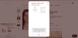
Charlotte Tilbury’s virtual makeup try-on.

Apps that allow users to view the furniture in their room thanks to 3D and augmented reality.
Personalization and customization
Tailoring the user experience to individual preferences will be a focal point in 2024. Ecommerce websites will leverage advanced AI algorithms to analyze user behavior and provide personalized product recommendations, creating a more intimate and relevant shopping journey.
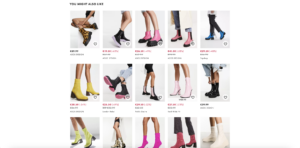
Asos provides users with related products based on their search history.
Minimalist and clean interfaces
Simplicity is timeless. Ecommerce websites in 2024 will adopt minimalist design principles, focusing on clean interfaces that reduce clutter and streamline the user experience. Minimalism not only enhances visual appeal but also improves site navigation and load times.
Here are some key principles for a clean UI design:
- Keep it simple: Avoid using multiple effects, transitions, colors, or typographic styles. Less is more.
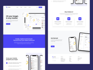
- Use of white/negative space: We usually focus on what to add to the designs, but this principle focuses on what not to add, instead. Providing some space around the elements placed in the design will help reduce the sensation of clutter. For example, see the design below from outcrowd.1
- Be consistent: Consistent UI means keeping things uniform: using the same design patterns, using the same words in prompts, keeping menus and screens similar, and using consistent commands throughout the interface. Building a comprehensive design system can greatly aid in achieving this consistency across diverse designs, ensuring a seamless and cohesive user experience.
- Hierarchy: Clear visual hierarchy is a fundamental design principle for a successful user interface. This involves organizing visual elements to convey the relative importance of each element, guiding users, and prompting them to take the intended actions.
- Follow the 60–30–10 rule when selecting your color palette: Opt for a streamlined approach with fewer colors to make your design more impactful. Allocate 60% of your design to a dominant color, reserve 30% for a complementary color, ideal for elements like cards and piles, and dedicate the remaining 10% to an actionable color, suitable for buttons and icons. Consistently use these chosen colors throughout the entire design process.
Dark mode dominance
Dark mode, once a niche feature, is set to dominate UI design in 2024. With benefits such as reduced eye strain and improved battery life for certain devices, dark mode will become a standard option for ecommerce websites, providing users with a sleek and modern alternative.
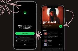
Spotify uses dark mode as the default.
Microinteractions for engagement
Microinteractions, subtle animations, and dynamic transitions will play a significant role in capturing user attention and enhancing engagement. From hover effects to animated product interactions, these small design details will contribute to a more enjoyable and memorable shopping experience.

Video credit to Sailesh Gunasekaran.2
Voice commerce integration
The rise of voice-activated devices and virtual assistants will lead to an increased focus on voice commerce. Ecommerce websites in 2024 will integrate voice search and command functionalities, making it easier for users to find products and navigate the site hands-free.

Google is an example of voice search functionality usage.
Accessible design for all
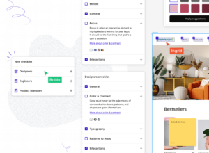
Inclusivity will be a central theme in UI design for 2024. Ecommerce websites will prioritize accessibility features, ensuring that people of all abilities can easily navigate and interact with the platform. This includes considerations for color contrast, text size, and assistive technologies.
Seamless cross-platform experiences
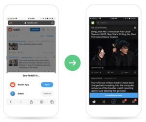
As users switch between devices throughout their day, ecommerce websites will prioritize seamless cross-platform experiences. Responsive design will be a given, but we can also expect more integration between mobile apps, desktop websites, and other digital touchpoints to create a cohesive user journey.
How Vaimo can help
As we move into 2024, ecommerce UI design will evolve to meet the changing needs and expectations of online shoppers. From immersive visuals to inclusive design, the trends outlined above showcase a commitment to creating user-friendly, visually stunning, and technologically advanced online shopping experiences. Embracing these trends will not only keep ecommerce websites competitive but also ensure they provide a delightful and memorable journey for every visitor.
At Vaimo, our experience design department works with our clients to ensure their digital storefronts not only meet the needs of customers but exceed their expectations. Vaimo worked with Finnish client Pure Waste to integrate eco-features, such as a Carbon and Water Footprint Report that calculates the carbon and water footprint at checkout and on product pages to indicate how much the shopper impacted the environment through their purchase. Find out how Vaimo helped Pure Waste reach its customers with a memorable experience.
Sources:
1 – Surface – Landing page design for CRM platform
2 – Submit Button – Micro Interaction – Dribbble.com


