As a UX Designer specialising in digital commerce, I’m often faced with tough questions to answer. Questions related to conversion optimisation are my favourite though, but they can be tricky.
On the topic of conversion, it can be argued that checkout is the most important step in the user journey…
For modern-day consumers with their high expectations, your checkout needs to be quick, easy, safe and secure. Any sense of hassle or jarring unpredictability will leave customers with a bitter taste in their mouths, running to the nearest competitor that can offer them the seamless experience they crave.
So, what makes a good checkout? Over the next couple of weeks, we’ll be aiming to answer that question.
Today we’ll consider the checkout flow length and the number of form fields required to checkout successfully. Once we have that foundation we’ll look at a vanilla version of Magento 2 and identify the low hanging fruit.
Let’s go!
What’s the average checkout flow length?
An important point to consider before calculating the checkout flow length is whether or not the shopping cart forms part of the checkout. We believe it should because the user is already starting to consider order totals, tax and coupons or gift cards.
In 2012, the Baymard Institute reported an average checkout flow length of 5.1 steps among the top 60 grossing US & EU online retailers (including the shopping cart). Four years later in 2016, that number went up to 5.42 steps on average.
In a 2019 benchmark test, Baymard reported the average number of steps on checkout dropped back to 5.1 steps. In 7 years of testing the average virtually stayed the same. Why?
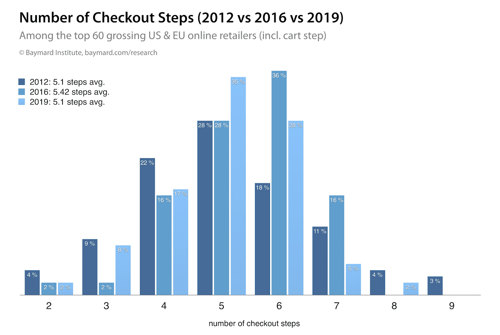
It’s clear to see that very short flows are in the minority and longer checkouts are practically dead, while the 5 to 6-step checkout flows saw a significant increase in use.

Magento 2 natively delivers a 6 step checkout. After the shopping cart, the user can log in or continue as a guest. Based on the previous decision a user either chooses a saved address or enters a new address before selecting a delivery method as a fourth step. Finally, the user has to select a payment method followed by an order confirmation screen.
Now, you might be asking “Can this flow be optimised by decreasing the steps?”. My response would be “Yes, but why?”. Sure we can see that five-step checkouts saw a significant increase in use since 2016, but a six-step checkout is not an anomaly by any stretch of the imagination.
The implementation complexity in removing a step (or combining two steps into one) should also make us stop and wonder if the juice will be worth the squeeze. Our friends at the Baymard Institute have the answer.
“While it may seem a little counter-intuitive, we consistently see during end-user testing and checkout benchmarking that the number of steps isn’t the most important aspect of the user’s checkout experience – rather it is what the user has to do at each of those steps that are important. (Up to a certain point at least, at 8 checkout steps and above usability do seem to suffer.)”
Source: https://baymard.com/blog/checkout-flow-average-form-fields
We agree. The number of checkout steps does not equal a good checkout. Rather, the number of form fields and how we ask the user to complete them has a direct impact on checkout conversion rates. This becomes even more important when we consider the checkout process on smaller devices where space comes at a premium. So make sure you take a mobile-first approach to your checkout process flow design.
How many form fields are there on an average checkout?
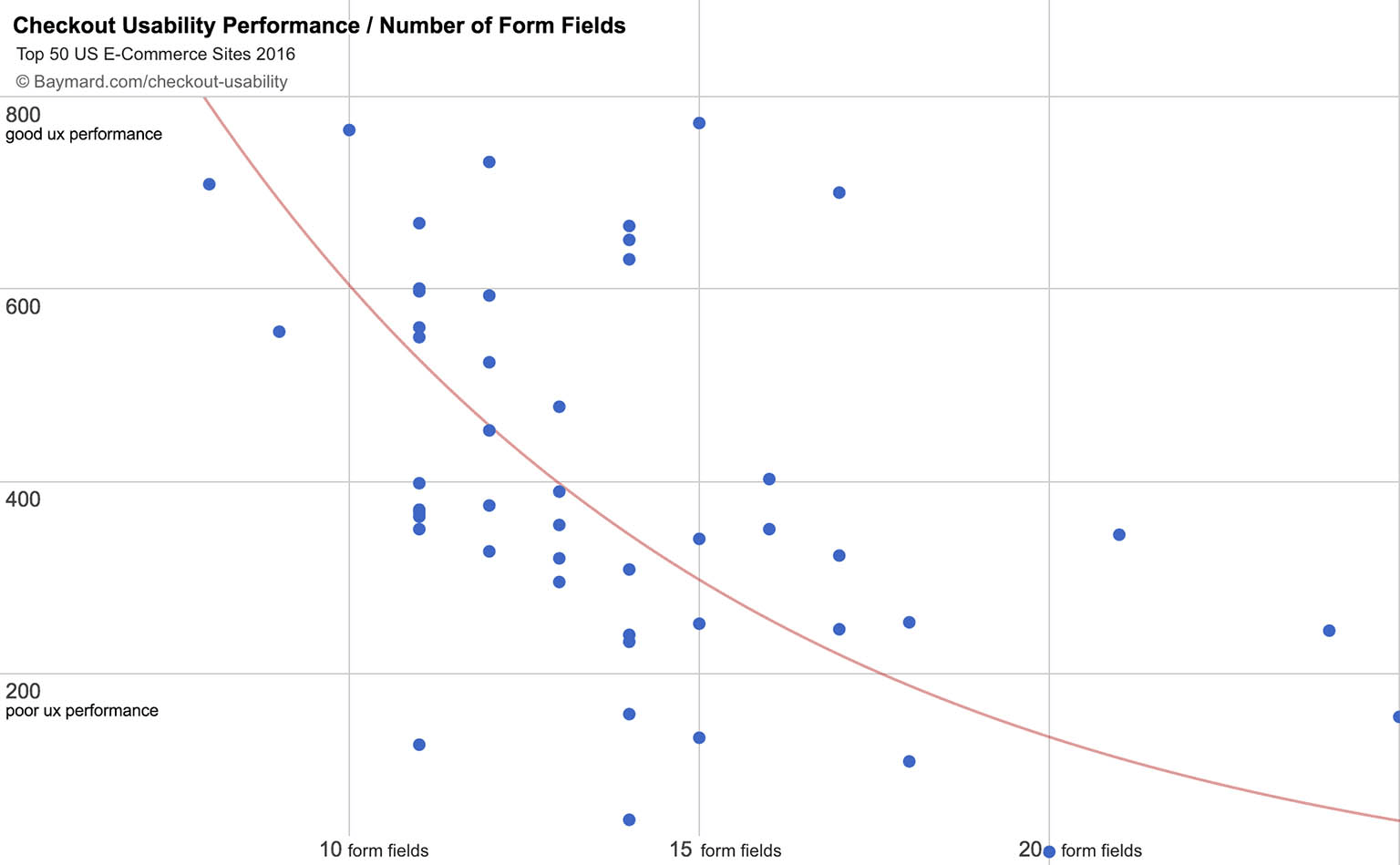
“…our benchmark reveals that the average checkout flow contains 23.48 form elements and 14.88 form fields (when purchasing as a new non-account customer). Yet a fully optimized checkout flow can be as short as 7 form fields, with a total of just 12 form elements.”
Source: https://baymard.com/blog/checkout-flow-average-form-fields
Have we maybe been focusing too much on the checkout flow step count, and neglected to count the number of fields a user needs to complete? And more importantly, how can we reduce the number of form fields on a native Magento 2 checkout?
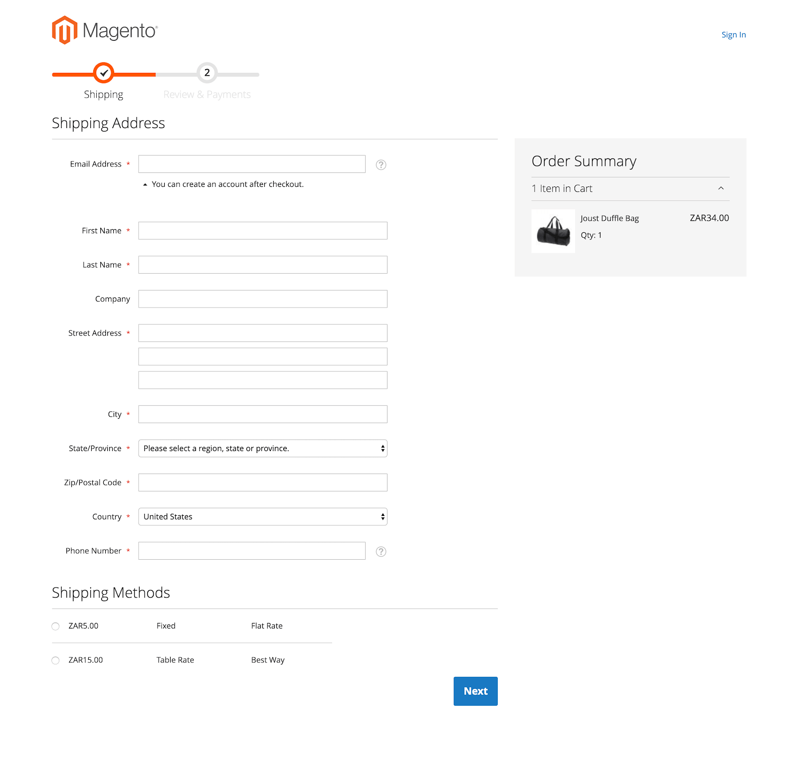
By default, a guest user is asked to complete 12 form fields on the delivery address step in Magento 2. Three of these fields are optional, so let’s start there.
Remove (or hide) optional fields
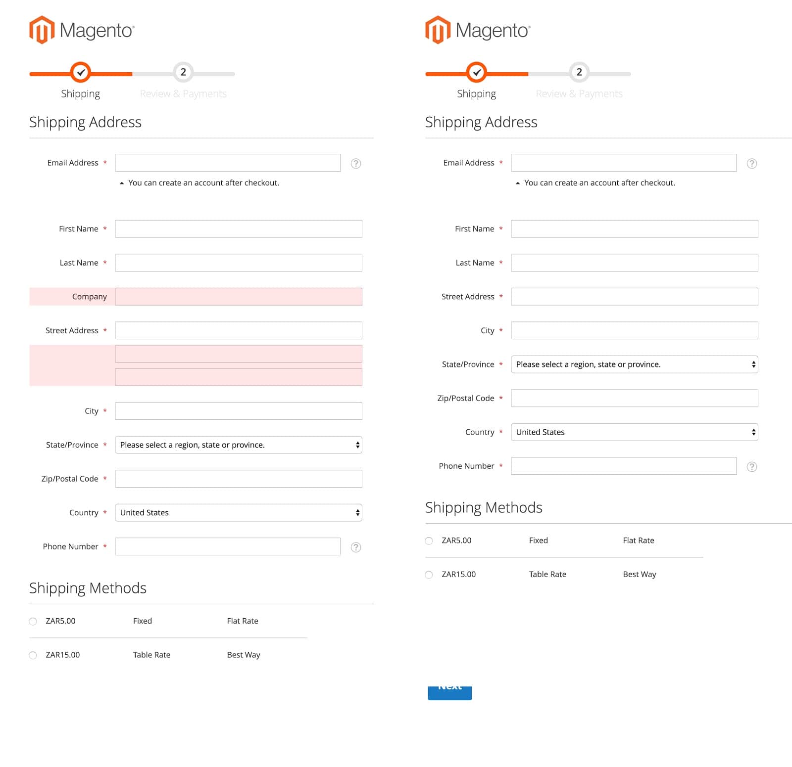 Unfortunately, we can’t simply remove the “Company” form field since a subset of users still makes use of a company address for their deliveries. The same can be said for the second “Street Address” field where information like apartment number or building name is important. However, since they’re not used by all users, they can be hidden behind a visibility toggle interaction.
We strongly recommend removing the third “Street Address” field. In Magento 2 this is a simple configuration setting found when you navigate to Stores / Configuration / Customers / Customer Configuration / Name and Address Options / Number of Lines in a Street Address. You can set the number of “Street Address” fields anywhere between one and four. Let’s make sure that doesn’t exceed two.
Remove (or disable) fields with only one option
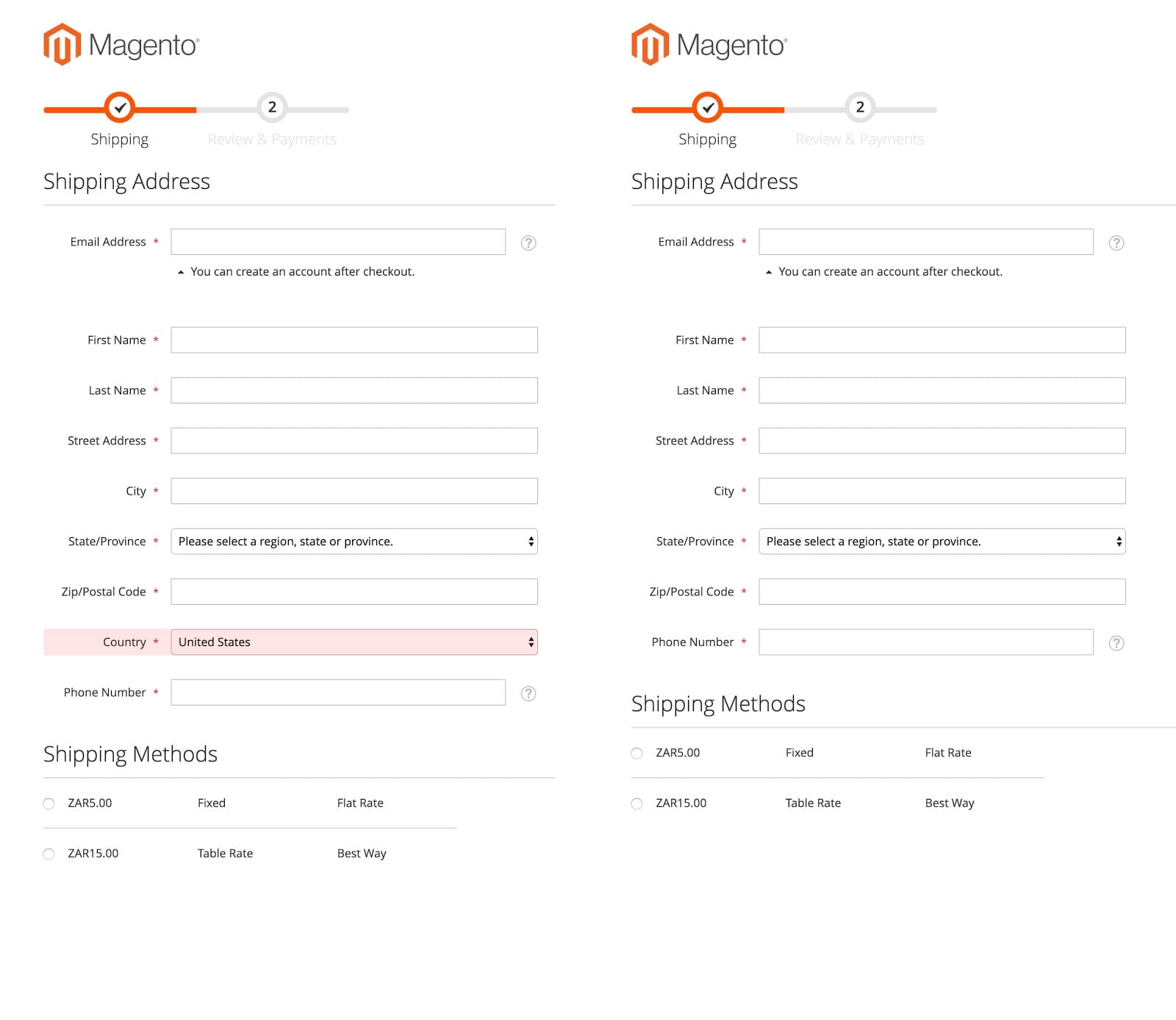 So, we’re down to 9 fields already. The next recommendation depends on the market you are serving. In South Africa (where I am based), the bulk of our clients do not support cross-border deliveries. Why ask the user to select a country when only one option is available? Sure we can prepopulate the country, but the user is still required to process the form field. At the very least, we should consider disabling the select form field and styling it down to avoid the user wasting a valuable click.
Implement Google Autocomplete
The final recommendation won’t remove a form field but does introduce a more efficient way to populate the form: Google Autocomplete. Autocomplete is a feature of the Places library in the Maps JavaScript API.
This implementation is arguably the most important optimisation tactic to consider in the checkout. When used correctly the user fills in their street address in the first field and the rest of the address form is autocompleted. Effectively this tactic reduces the number of interactions with form fields by a further 3 to 4 interactions, depending on your decision about the “Country” field.
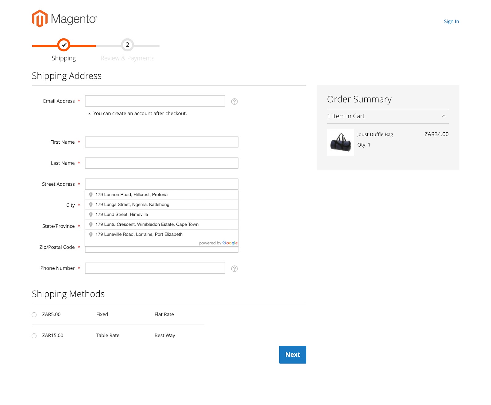
If all of these recommendations are applied, you’ve successfully optimised a native Magento 2 checkout flow from a 12 field form to an 8 field form with as little as 5 required interactions.
As a result, your customers now benefit from a quicker checkout process with less hassle and friction. And at a time when customer expectations are at an all-time high, this is a sure-fire way to increase conversions, sales and your bottom line.
Conclusion
If you’re in the process of optimising your checkout flow, we’d encourage you to shift focus away from reinventing the wheel—to the small wins and A/B testing these to keep track of the impact on your customer experience. That being said, checkout flow steps are not completely irrelevant, and next time we’ll consider the various types of checkouts seen in the market and how they perform comparatively.
If you’d like to optimise your checkout flow for an improved customer experience, then reach out to our UX Team today!


